Web-Safe Fonts for Email: The Real Support Matrix in 2026
The web has had reliable webfont support for fifteen years; email has not. Outlook desktop — still ~30% of B2B inboxes — uses the Word HTML rendering engine, which doesn't load @font-face webfonts at all. It falls back to the next available font in your stack, which historically meant Times New Roman if you didn't supply a fallback.
That's the trap: a designer mocks up an email in Inter or Manrope, the email ships, half the recipients see the brand font, the other half (Outlook desktop) see Times New Roman or Arial. The visual brand collapses for those recipients without anyone noticing — A/B test results, design QA, marketing review all happen on Mac/Apple Mail or Gmail web, where the webfont loaded fine.
This guide walks through which email clients support webfonts (and which don't), the @font-face / @import patterns that work in email, web-safe font stacks that hold up as fallbacks, the system-font approach that's increasingly the right answer, common gotchas (font weight inheritance, font-family on nested tables), and a free font checker that previews any font stack across the major email clients.
What you will learn: The webfont support matrix across major email clients (who supports @font-face, who supports @import, who falls back), the bulletproof font-loading pattern using both @import and @font-face plus an MSO conditional, web-safe fallback stacks for sans / serif / mono, the system-font stack and when it's the right call, common gotchas (weight mapping, font-family inheritance through tables, FOUT), and how to use the free MiN8T Font Checker.
1 Why Fonts Are Hard in Email
The web has had reliable webfont support for fifteen years; email has not. Outlook desktop — still ~30% of B2B inboxes — uses the Word HTML rendering engine, which doesn't load @font-face webfonts at all. It falls back to the next available font in your stack, which historically meant Times New Roman if you didn't supply a fallback.
That's the trap: a designer mocks up an email in Inter or Manrope or whatever the brand font is, the email ships, half the recipients see the brand font, the other half (Outlook desktop) see Times New Roman. The visual brand collapses for those recipients without anyone noticing — A/B test results, design QA, marketing review all happen on Mac/Apple Mail or Gmail web, where the webfont loaded fine.
The fix is a two-part strategy: (1) ship the webfont via @font-face and @import for clients that support it (Apple Mail, iOS Mail, Gmail web on Chrome), and (2) provide a deliberate, brand-appropriate fallback stack for clients that don't (Outlook desktop, Outlook on the web in some configurations, corporate mail clients). Done right, every recipient sees a consistently designed email even if the specific font differs.
What this article walks through
Which email clients support webfonts and which don't (the actual support matrix in 2026), the @font-face / @import patterns that work in email, web-safe font stacks that hold up as fallbacks, the system-font approach that's increasingly the right answer, common gotchas (font weight inheritance, Outlook's font-family handling), and a free font checker that previews any font stack against the major email clients.
The font you mock up the email in is not always the font your recipient sees. Webfont support is patchy; a deliberate fallback stack is what holds the brand together when @font-face fails.
2 The Webfont Support Matrix in 2026
The clean answer: roughly half of email opens render webfonts; the other half don't. Here's the breakdown.
Render webfonts (@font-face works):
- Apple Mail (macOS) — full support
- iOS Mail — full support
- Outlook for Mac — full support
- Gmail web — partial support (specific Google Fonts only via @import)
- Yahoo Mail web — partial support
- Outlook.com web — partial support
Do NOT render webfonts:
- Outlook 2007–2024 desktop (Windows) — falls back to fallback stack
- Gmail Android app — falls back
- Gmail iOS app — falls back
- Most corporate mail clients (Notes, Lotus, etc.) — falls back
- Plain-text-only clients — obviously, no fonts at all
Audience-level numbers: a typical B2B audience opens 30–40% in Outlook desktop, 15–25% in Gmail mobile, 15–20% in Apple Mail, with the rest scattered. Roughly half the audience does not see your webfont. Plan for that.
The "partial support" footnote on Gmail web
Gmail web only loads webfonts hosted at Google Fonts via the @import directive at the top of the <style> block. Self-hosted webfonts via @font-face don't load. @import url('https://fonts.googleapis.com/css2?family=Manrope:wght@400;700&display=swap'); works; @font-face { src: url('https://my-cdn.com/manrope.woff2'); } does not.
This is the practical reason most teams just use Google Fonts for email: not because Google Fonts is technically better, but because it's the only way Gmail web loads a webfont.
3 The @font-face Pattern That Works
The bulletproof pattern uses both @import (for Gmail web) and @font-face inside conditional comments (for Outlook). It looks like this in the <head> of your email:
<style type="text/css">
  /* Gmail web reads @import */
  @import url('https://fonts.googleapis.com/css2?family=Manrope:wght@400;700&display=swap');

  /* Apple Mail and iOS read @font-face directly */
  @font-face {
    font-family: 'Manrope';
    font-weight: 400;
    src: url('https://fonts.gstatic.com/s/manrope/...woff2') format('woff2');
  }
</style>

<!--[if mso]>
<style>
  /* Outlook gets the fallback stack only */
  body, td, p { font-family: Arial, sans-serif !important; }
</style>
<![endif]-->
Why both @import and @font-face
Gmail web specifically reads @import and ignores most @font-face. Apple Mail reads both. Some Yahoo and Outlook.com web clients read @font-face but not @import. Including both maximizes coverage. The redundancy is cheap and the guarantee is meaningful.
Always specify the fallback in font-family
font-family: 'Manrope', 'Helvetica Neue', Arial, sans-serif;Outlook will try the named webfont, fail to load it, then fall through your stack until it finds something. Always end with a sans-serif or serif generic family so there's a guaranteed last-ditch fallback.
The MSO conditional comment pattern
Outlook-specific styles inside <!--[if mso]> get applied only by Outlook. The pattern above forces Outlook to use Arial regardless of what the brand font is — the rationale is that Arial in Outlook reliably renders identically across Outlook 2007 through Outlook 2024, whereas trying to inherit through the fallback stack sometimes hits weird Outlook-specific font substitutions.
4 Web-Safe Font Stacks for Fallbacks
The fallbacks are the load-bearing layer. Here are the stacks that hold up.
Sans-serif: Arial-leading
font-family: 'Manrope', 'Helvetica Neue', Helvetica, Arial, sans-serif;Arial is on every Windows install since the early 90s and on every macOS/iOS install. It's the safest sans-serif fallback. Helvetica Neue is preferred where available (macOS/iOS) and falls through to Arial elsewhere. This stack is appropriate when your brand font is a humanist or geometric sans-serif (Manrope, Inter, Poppins, Open Sans).
Serif: Georgia-leading
font-family: 'Lora', Georgia, 'Times New Roman', Times, serif;Georgia was designed for screen readability and is preinstalled on every Windows and macOS system. It's the right serif fallback for brand fonts in the editorial / publishing / luxury space. Times New Roman as a final fallback is intentional — if you're in a context where Outlook fell all the way back to Times, at least Times is still a serif that matches the design intent.
Monospace: where applicable
font-family: 'JetBrains Mono', 'Source Code Pro', Consolas, 'Courier New', monospace;Most marketing email doesn't need monospace. Developer-facing emails (code snippets, IDs, log output) sometimes do. Consolas ships with every modern Windows; Courier New is the universal final fallback.
The opinionated take: sans-serif Arial-leading covers 90% of brands
If you're not in editorial or luxury, your fallback stack should end in Arial, sans-serif. The brand-font-loaded experience is for the half of recipients who get webfonts; the brand-font-failed experience needs to be clean and legible, and Arial is the cleanest legible sans-serif on every email-rendering platform.
5 The System-Font Stack: A Pragmatic Alternative
If you don't have a strong brand-font commitment, the system font stack is increasingly the right answer for email. It uses whatever the operating system's native UI font is — San Francisco on Apple, Segoe UI on Windows, Roboto on Android.
font-family: -apple-system, BlinkMacSystemFont, 'Segoe UI', Roboto, Oxygen, Ubuntu, Cantarell, 'Helvetica Neue', Arial, sans-serif;Why it works
The recipient's email looks like a native part of their OS — same typography as their settings, their messages, their browser UI. There's no font loading delay, no FOUT (flash of unstyled text), no fallback gap. The email feels integrated into the platform rather than imposed on it.
The tradeoff
You give up brand-specific typography. The same email looks different to a Windows recipient (Segoe UI) and a Mac recipient (San Francisco) and an Android recipient (Roboto). For some brands that's a problem; for others it's a feature.
When system fonts are the right call
Newsletter formats, transactional emails, content-heavy emails where the typography should disappear, B2B notifications where consistency with the OS is friendly. When system fonts are wrong: highly designed marketing campaigns, brand-launch announcements, anything where the typography is part of the brand's signature.
6 Common Gotchas
1. Font weight mapping when the webfont fails
You ship Manrope at weight 600 (semibold). The webfont doesn't load. Your fallback is Arial. Arial doesn't have a 600 weight. The browser/email client picks the closest available weight, which may be 700 (bold) — suddenly your "subheading" looks heavier than intended. Solution: specify weights that all your fallback fonts have (400 regular, 700 bold are universal).
2. font-family on tables doesn't always inherit
Outlook desktop is famous for not inheriting font-family through nested tables. The fix: set font-family on every <td> that contains text, not just on the parent <table> or <body>. Yes, it's verbose. Yes, it's the only thing that reliably works.
3. Unicode characters falling back to a different font
Emoji, smart quotes, em-dashes, special symbols all fall back to a system font (often Apple Color Emoji or Segoe UI Symbol) regardless of your stack. That's usually fine but occasionally jarring — an emoji in the middle of brand-font copy looks like it's in a different font, because it is.
4. The flash of unstyled text problem
Email rendering is generally synchronous (the email loads, the webfont loads, then the email renders). But on slow connections, recipients sometimes see a flash of fallback font followed by webfont-replacement. font-display: swap in @font-face minimizes this by rendering with the fallback immediately and swapping when the webfont arrives.
5. The Google Fonts URL parameters that matter
The display=swap parameter at the end of the Google Fonts @import URL is the email-friendly default. The display=block alternative hides text until the webfont loads — good for marketing landing pages, bad for email where you want recipients to be able to read the email immediately.
7 Testing and the 2026 Take
You can't trust documentation about which clients support which fonts — the matrix changes, configs differ, corporate clients are unpredictable. Test the actual rendering.
Test the major clients
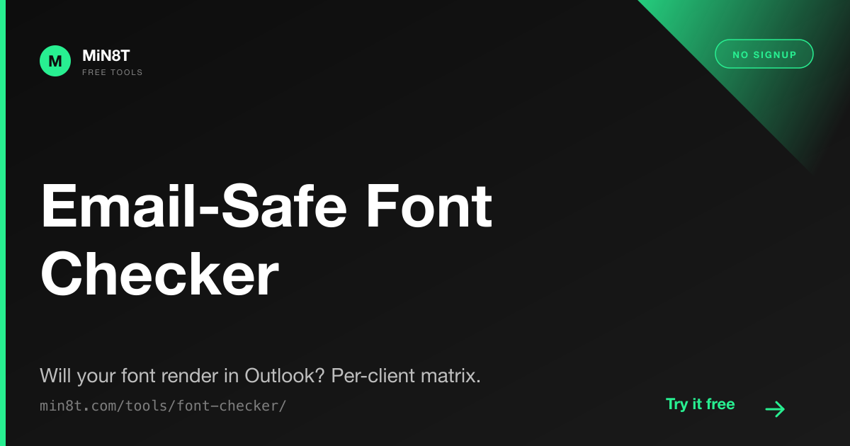
The minimum bar: Outlook desktop, Apple Mail, Gmail web, Gmail mobile (Android and iOS), Yahoo Mail web. If you're shipping to a B2B audience, add Outlook web and Outlook for Mac. Litmus and Email on Acid offer rendering screenshots across all of these; for free, you can use real test accounts or the MiN8T Font Checker which previews font stacks side-by-side.
The 2026 take on fonts in email
Webfont support has been "we're working on it" for fifteen years and Outlook desktop has been the holdout for all fifteen. That's not changing in 2026. Microsoft moved Outlook for Mac to the WebKit-based rendering engine and font support there is now full; Outlook desktop on Windows is still the Word engine and still doesn't load webfonts.
The right defensive strategy in 2026: ship the brand webfont via @import for Gmail web, ship it via @font-face for Apple/iOS, accept that Outlook desktop recipients see Arial, write the fallback stack to make Arial look intentional rather than emergency. The system font stack is the cleanest possible Outlook-aware font choice and increasingly the default for newsletters and transactional email.
The free font checker
The MiN8T Font Checker renders any CSS font stack across the major email clients side-by-side, so you can see what your fallback actually looks like before sending. Free, no signup, runs in the browser.
Brand Fonts Configured Once
MiN8T's Brand Guidelines module stores your brand font + fallback stack centrally. Every email built on the platform inherits the right @import and @font-face patterns automatically. No copy-pasting font URLs across templates; no surprised-by-Outlook moments.
Start Building for Free