Building a Brand Palette From a Logo: Extract, Tint, Validate (2026)
If your team doesn't have a brand book and you need a palette that works for email design, the fastest path is to extract dominant colors from your logo — not from imagination, not from "this looks brandy," but from the actual pixels of your highest-fidelity brand asset. The math is solved (k-means clustering on RGB), the tooling is open-source, and the output is reproducible.
This guide walks through how color extraction algorithms work, how to turn 5 dominant colors into a full design palette with 9-tint scales (Material Design-style), how to validate WCAG accessibility contrast on the resulting palette, output formats for different codebases (CSS variables, Tailwind, JSON, SCSS), email-specific considerations like dark-mode auto-inversion, and a free in-browser extractor that runs the full pipeline.
What you will learn: How k-means clustering produces dominant colors from any image, how to expand 5 colors into a 90-color design system with OKLab interpolation, WCAG AA contrast validation on color pairs, output formats for CSS / Tailwind / SCSS / JSON, and email-specific considerations (dark-mode auto-inversion, Outlook color quantization, table background-color quirks). Hero by the free MiN8T Brand Color Palette Extractor.
1 Why Pull Brand Colors From a Logo
The most common pattern for setting up email design: open the brand book, copy the hex codes, paste them into your CSS. Done in 30 seconds, works fine. Why would you ever extract colors from an image instead?
Three real cases:
1. You don't have a brand book
Most early-stage companies don't. A founder asked a designer for a logo, paid for a single deliverable, never followed up with a comprehensive brand system. The brand "exists" as a single SVG file. Extracting the colors from that SVG (or its PNG export) is the fastest way to get a baseline palette.
2. You have a logo but you're designing something the brand book didn't cover
The brand book specifies primary green and secondary gray. Your hero illustration has a sunset, an ocean, a midcentury sofa. You need a complementary tertiary color. Extracting from your hero image's actual pixels gives you a palette that's harmonious with the image (because it came from the image) rather than a guessed-at "I'll just pick a teal."
3. You're auditing color usage
"What's actually in our brand?" Pull every product image, every hero, every category banner. Extract dominant colors. Now you have data on what colors your brand visually uses, vs. what colors the brand book claims. The two often diverge in interesting ways.
What this article walks through
How color extraction actually works, the algorithms (k-means clustering on RGB), how to turn a 5-color extraction into a full design palette with tints + shades, WCAG contrast checking on extracted pairs, output formats (CSS variables, Tailwind config, JSON), and a free in-browser extractor.
2 How Color Extraction Works
"Pull dominant colors from this image" is a clustering problem. The image has thousands of pixels each with an RGB value; you want to compress them down to (say) the 5 colors that best represent the image as a whole.
The algorithm: k-means clustering on RGB
K-means is the canonical clustering algorithm for "find k centers in a multi-dimensional space such that every point's distance to its nearest center is minimized." Applied to RGB pixel values, it finds k colors that minimize the total color difference between every pixel and its nearest cluster center.
The output is k colors plus the count of pixels assigned to each. Sort by count, descending; you have your dominant 5 (or 8, or whatever you ask for).
Why k-means is the standard
It produces results that visually match what humans expect. Other algorithms (median cut, octree, neural-net-based) produce comparable results for typical inputs but k-means is the simplest, fastest, and most-commonly-implemented. Color Thief, the open-source library used by most browser-based extractors (including ours), wraps a k-means implementation with sensible defaults.
What you should know about edge cases
K-means produces dominant colors based on pixel count. If your image has a 90%-white background and a small green logo, the extraction returns "white, white, white, white, green." That's not what you want for brand work; you want green and the supporting accents.
Most browser extractors handle this with a "ignore near-white and near-black" filter before clustering. Pixels close to pure white (#fafafa+) and pure black (#0a0a0a-) are excluded so the extraction returns colors that matter, not the background.
Be aware: this filter occasionally over-corrects on logos that legitimately use white-on-color or black-on-white as their primary. If your extraction "doesn't look like the logo," check whether the filter dropped colors that were actually intentional.
3 From 5 Colors to a Full Palette
An extraction gives you 5 dominant colors. A design palette has way more — tints (lighter variants), shades (darker variants), accent variations. To turn the 5 into a usable system, you generate a series of related colors per base.
The Material Design tint scale
The most common pattern is the Material Design 50–900 scale: per base color, generate 9 tints from very light (50) to very dark (900). The base color sits in the middle (typically 500 or 600). Lighter tints work as backgrounds; darker shades work as text on light backgrounds.
Example for #28ef91 (MiN8T's brand green):
- 50: #f0fdf4 (almost-white green tint, for subtle backgrounds)
- 100: #dcfce7
- 200: #bbf7d0
- 300: #86efac
- 400: #4ade80
- 500: #28ef91 — base
- 600: #1fbb70
- 700: #168954
- 800: #0d5b39
- 900: #043d23 (almost-black for text on light backgrounds)
Generating the scale
The math is interpolation in a perceptually-uniform color space (OKLab or LAB), not naive RGB interpolation. Naive RGB produces tints that look "off" because human color perception isn't linear in RGB. chroma.js handles this in JS; most extractors use it under the hood.
What you actually use
Of the 9 tints, you'll use maybe 4–5 in practice:
- 50–100: backgrounds (callout boxes, success messages, alert banners).
- 500 (base): primary buttons, links.
- 700–800: text on light backgrounds, hover states.
- 900: body copy if your brand is "dark text on warm-tinted backgrounds."
Generating all 9 is cheap; using all 9 is rare. The rest of the scale exists for the unusual cases.
4 WCAG Contrast on Extracted Pairs
Color pairs that look fine to a designer can fail accessibility contrast standards, which means subscribers with vision differences can't read your text. Extraction produces colors; generation produces tint scales; contrast checking validates which combinations are legible.
The WCAG AA threshold
Contrast ratio between text color and background color must be at least 4.5:1 for normal text, 3:1 for large text (18pt+ or 14pt+ bold). Below those thresholds, low-vision readers can't distinguish foreground from background.
The math
The formula is (L1 + 0.05) / (L2 + 0.05), where L1 and L2 are relative luminances of the two colors (with L1 being the lighter). Relative luminance is a non-trivial calculation that accounts for the fact that human eyes are more sensitive to green than red than blue. Don't try to derive it manually; libraries (chroma.js, color-js) ship the math.
The practical workflow
For each pair (text color × background color) you intend to use, compute the ratio. Mark each pair as AA-pass or AA-fail. Use only AA-pass pairs in your design.
From a 5-color extraction with 9-tint scales, you have 90 colors total (5 base × 9 tints × 2 directions). Most pairs are uninteresting (very light against very light, etc.). The pairs you care about: each base color's 500 against white, each base's 500 against the 900 of itself or another base, the 700–800 range against the 50–100 range.
The output
A grid showing every meaningful pair with its contrast ratio and AA-pass marker. Designers pick from the grid — "I'll use the 700 of the green base for body text on white" — with the contrast already validated.
5 Output Formats
Once you have a palette + tint scale + contrast validation, you need to get the colors into your codebase. Different teams use different formats; a good extractor exports several.
CSS custom properties
:root {
  --brand-green-50: #f0fdf4;
  --brand-green-100: #dcfce7;
  --brand-green-500: #28ef91;
  --brand-green-700: #168954;
  /* ... */
}
Use in stylesheets via color: var(--brand-green-500). Most modern web codebases. Note: most email clients ignore CSS custom properties — use them in the source, then resolve to literal values via your inliner or build step before sending.
Tailwind config
// tailwind.config.js
module.exports = {
  theme: {
    extend: {
      colors: {
        'brand-green': {
          50: '#f0fdf4',
          100: '#dcfce7',
          500: '#28ef91',
          700: '#168954',
        },
      },
    },
  },
};
For Tailwind users. Drops in directly; you can use bg-brand-green-500 and text-brand-green-700 in your markup.
JSON
{
  "brand-green": {
    "50": "#f0fdf4",
    "100": "#dcfce7",
    "500": "#28ef91",
    "700": "#168954"
  }
}
Generic format. Useful when you're consuming the palette in a tool that needs structured data — Figma plugins, design-token systems, custom scripts.
SCSS variables
$brand-green-50: #f0fdf4;
$brand-green-100: #dcfce7;
$brand-green-500: #28ef91;
$brand-green-700: #168954;
For Sass-based codebases. Identical contents to CSS variables, different syntax.
The right output depends on your codebase. Most extractors export several formats so you can pick.
6 Beyond Logo Colors: Email-Specific Considerations
A general-purpose palette works for the web. Email has additional constraints worth knowing.
Dark mode inverts colors automatically in some clients
Apple Mail, Gmail (mobile dark mode), and Outlook on the web auto-invert dark text to light when the user is in dark mode. The catch: they invert some colors and not others, and the rules are inconsistent. A black-text-on-white-background email becomes white-text-on-black; but a green-button-with-white-text might become a green-button-with-dark-text (bad contrast). The companion piece Dark Mode Email Design walks through the inversion rules.
Limited color rendering in older Outlook
Outlook 2007–2010 (a small but persistent slice of B2B audiences) renders only a 256-color palette in some contexts. Custom hex codes get quantized to the nearest "web-safe" color. The visual difference is minor for most palettes but can be jarring for subtle gradients or pastel tints.
Background colors on tables
Outlook desktop has known issues rendering background-color on <table> and <td> elements when the cell content is a single image. The fix: always set bgcolor attribute alongside the CSS background-color, since some Outlook versions honor the HTML attribute but not the CSS.
Border-color on Outlook
border properties work in Outlook desktop but border-radius doesn't (the Bulletproof Button article covers the workaround). Bordered boxes with rounded corners need either VML wrapping or square corners.
The pragmatic email palette
For most email-only use cases, you need:
- Brand primary (the most-used CTA color).
- Brand secondary (alt CTA, background accent).
- Body text dark (typically 800–900 of any base or pure dark gray #1a1a1a).
- Body text muted (700 of body-text base or #666666).
- Background light (white or 50 of any base).
- Background tinted (100 of any base, for callouts/banners).
That's 6 colors total. Email design gets simpler than web design because the supported CSS is smaller. You don't need a 30-color palette; you need 6 well-chosen ones.
7 Try It in the Browser
Hand-extracting colors with Photoshop's eyedropper, then computing tints in chroma.js, then validating contrast in a spreadsheet, takes 30 minutes per logo. A browser-based palette extractor that runs the full pipeline takes 30 seconds.
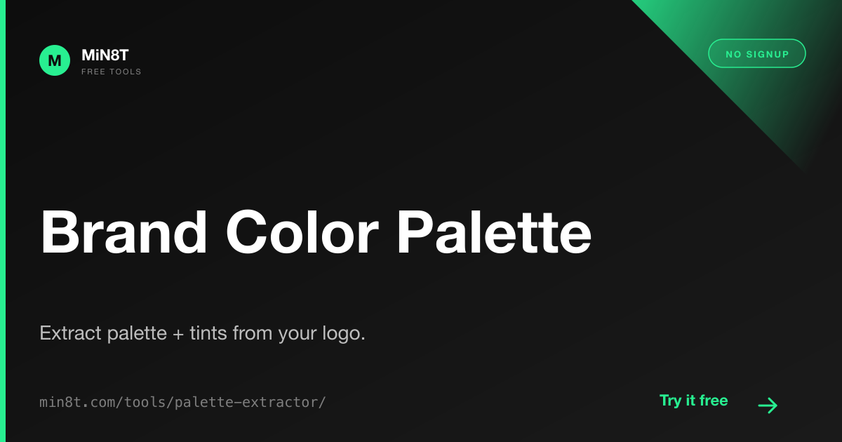
MiN8T Brand Color Palette Extractor
Drop a logo or hero image; get 5 dominant colors plus 9 tints each in OKLab interpolation. WCAG contrast checks on every pair. Export to CSS, Tailwind, SCSS, or JSON. Free, in-browser.
Open the Palette Extractor →The full brand-color workflow
- Extract from your highest-fidelity logo asset. SVG is best (lossless); PNG is fine; JPEG can introduce compression artifacts that produce noisy extractions.
- Review the 5 dominant colors. Drop any that look like background pixels rather than brand colors.
- Generate tint scales for each kept base. Pick 4–5 you'll actually use.
- Validate WCAG AA contrast on the pairs you intend to ship. Fix any pairs that fail by picking a darker shade for text.
- Export to your codebase's preferred format. Drop into your CSS / Tailwind config / design-token system.
- For email: resolve CSS custom properties to literal hex codes via your inliner. Email clients mostly don't support
var(--x).
For teams with a brand book
Even if you have an established palette, running an extraction on your hero images can reveal that you're shipping colors the brand book doesn't approve — product photos with unintended teal accents, illustrations with unauthorized purple. The data is useful for brand-governance audits separate from net-new palette generation.
The MiN8T integration
Once you have your palette, MiN8T's Brand Guidelines module stores it once and applies it to every email you build. Stop hand-pasting hex codes into every campaign — configure the palette in one place, have it appear as picker swatches across the editor.
Use the Palette Across Every Campaign
MiN8T's Brand Guidelines module stores your palette once and applies it as picker swatches in the editor for every email you build. Stop hand-pasting hex codes. Configure once, apply forever.
Start Building for Free