Bulletproof Email Buttons: Why VML Still Matters in 2026
Most online email button generators ship buttons that work fine in modern email clients and look like square boxes in Outlook desktop. The reason: rounded corners require VML — Microsoft's pre-SVG vector format — for Outlook desktop's Word renderer to draw them. Most generators skip the VML half because it's verbose and ugly. The result: your CTA looks designed in 92% of email clients and broken in the other 8% (B2B audiences: 35%).
The fix is the bulletproof button pattern: a VML <v:roundrect> wrapped in [if mso] conditional comments alongside the modern <a> wrapped in [if !mso]. Six lines of additional HTML; renders correctly in every major email client.
This guide walks through the full pattern annotated, why VML still matters in 2026 (Outlook desktop is frozen and won't change), the inputs that determine button design, when you don't need the VML half, common gotchas, and a free in-browser generator that ships the full bulletproof pattern by default.
What you will learn: The full bulletproof button pattern with code annotations, why Outlook desktop's 27-year-old VML format is still the only way to get rounded buttons across all clients, the input choices (color, padding, radius, font) that matter most, when you can skip VML safely, common gotchas like arcsize math and centering issues, and how to use the free MiN8T Bulletproof Button Generator.
1 Why "Bulletproof" Buttons Are a Thing
"Bulletproof" is email-developer slang for HTML+CSS that survives every major email client unchanged. It's specifically a problem for buttons because email's biggest CSS gap — border-radius in Outlook desktop — turns a designed rounded button into a square box if you don't use a specific workaround.
The workaround is VML — Microsoft's pre-SVG vector format from the late 1990s, still rendered by Outlook desktop in 2026 because Microsoft's HTML renderer has not been meaningfully updated in over a decade. Wrap a <v:roundrect> element in MSO conditional comments, and Outlook desktop renders a real rounded button. Every other client ignores the conditional block and falls back to the modern <a> styled with border-radius.
Most online button generators ship the modern half and call it a day. The result: their buttons render as squares in Outlook desktop, which depending on your audience is 7–35% of opens. That's a meaningful slice of subscribers seeing your designed pill-shaped CTA as an angular block that looks like a placeholder.
What this article walks through
The full bulletproof pattern with code, why each part exists, the Outlook desktop quirks that drive it, alternatives to VML for less critical buttons, and a free in-browser generator that ships the full pattern by default.
Most "free email button generators" produce buttons that break in Outlook desktop. The bulletproof pattern is six lines of HTML longer; it covers ~10% more of your audience correctly.
2 The Bulletproof Pattern, Annotated
Here's the full pattern for a green pill button linking to a homepage — you can generate the same markup with custom colors and labels via our bulletproof email button generator:
<!--[if mso]>
<v:roundrect xmlns:v="urn:schemas-microsoft-com:vml"
             xmlns:w="urn:schemas-microsoft-com:office:word"
             href="https://example.com/"
             style="height:44px; v-text-anchor:middle; width:200px;"
             arcsize="50%"
             stroke="f"
             fillcolor="#28ef91">
  <w:anchorlock/>
  <center style="color:#0d0d0d; font-family:Arial,sans-serif;
                  font-size:16px; font-weight:700;">
    Get started
  </center>
</v:roundrect>
<![endif]-->
<!--[if !mso]><!-- -->
<a class="btn-cta" href="https://example.com/"
   style="background-color:#28ef91; border-radius:999px; color:#0d0d0d;
          display:inline-block; font-family:Arial,sans-serif;
          font-size:16px; font-weight:700; line-height:20px;
          padding:14px 32px; text-decoration:none; mso-hide:all;">
  Get started
</a>
<!--<![endif]-->
Three things are happening:
1. The [if mso] conditional
Microsoft Outlook desktop honors conditional comments — it renders content inside <!--[if mso]>...<![endif]--> blocks and treats them as live HTML. Every other client treats those comments as standard HTML comments and ignores their content. The first block is therefore "Outlook-only."
2. The VML <v:roundrect>
VML is Microsoft's pre-SVG vector format. <v:roundrect> draws a rounded rectangle with the specified fillcolor, stroke, and arcsize (corner radius as a percentage of the smaller dimension — 50% gives a fully-pilled shape). The w:anchorlock element makes the rectangle clickable as a link. The <center> inside contains the styled label text.
This produces, in Outlook desktop, a real rounded button with the right colors and the right font. Every other client ignores it.
3. The [if !mso] conditional + modern HTML
The second block is the standard HTML+CSS you'd write for any modern email client — an <a> styled with border-radius, padding, font weight. Outlook desktop honors the !mso conditional by not rendering it (the negative match). Every other client treats it as normal HTML and renders the styled link.
mso-hide:all on the <a> is a defense-in-depth: it tells any Outlook variant that does render the link to hide it, preventing duplicate buttons appearing.
Net result: Outlook desktop sees the VML button. Apple Mail, Gmail, Yahoo, Outlook web see the styled <a>. Every reader sees a rounded pill.
3 Why VML Still Matters in 2026
The natural question: it's 2026. Why is VML — a 27-year-old pre-SVG vector format — still relevant?
Outlook desktop is frozen
Microsoft Outlook for Windows uses the Microsoft Word HTML rendering engine. That engine has been substantially unchanged since Office 2007. Microsoft has explicitly stated they don't plan to modernize it because Office customers (large enterprises) prefer rendering stability over new CSS features — a corporate email that looked the same in Outlook 2010 should look the same in Outlook 2025. Stability won; modernization lost.
Outlook desktop's market share is small but valuable
Outlook desktop on Windows is roughly 7–9% of B2C email opens but can be 25–40% of B2B opens. For consumer brands, the impact of a broken Outlook button is small. For B2B SaaS, financial services, healthcare, and government — where Outlook is the default work email — the impact is significant. The decision tree is: if your audience includes Outlook desktop and the click is the campaign's success metric, ship VML.
The alternative formats don't render
You can't ship an SVG button in email — SVG support is uneven across email clients. You can't use a styled <button> element — most clients strip <button>. You can't use CSS border-radius alone — Outlook desktop ignores it. The bulletproof pattern is the only widely-compatible path to a rounded button across every major client.
The cost is low
Six lines of additional HTML per button. The mso-conditional template is the same for every button you'll ever build — a generator can produce it. Once you have the template, the marginal cost of "one more bulletproof button" is the same as "one more styled link." There's no real downside to using the pattern.
4 The Inputs That Matter
Designing a button for email comes down to a small number of inputs. Each has email-specific guidance.
Background color
High contrast against the surrounding email background. If your email body is white (#ffffff) and your button is light gray (#e0e0e0), the button blends in. Aim for 4.5:1 WCAG AA contrast against the surrounding background.
Text color
High contrast against the button background. Same 4.5:1 ratio. Match the button color's luminance: light buttons get dark text, dark buttons get light text. Counter-intuitively, mid-gray text on a dark button can fail contrast even when both colors look "right" together.
Padding
14–16px vertical, 28–36px horizontal is the standard email-friendly button size. Smaller starts looking cramped; larger starts feeling too dominant. Mobile readers are using fingers; sub-44×44px tap targets fail Apple's accessibility guidelines and feel "fiddly" to tap.
Border radius
0px (square), 4–8px (subtle round), or 999px (full pill) are the three common shapes. Anything in between (12–30px partial rounding) looks unintentional. Pick one of the three.
Font
System sans-serif — Arial, Helvetica, or the platform default. Custom web fonts don't render in Outlook desktop. Wrap your font-family stack as 'Inter', Arial, sans-serif so Apple Mail and Gmail web get Inter; Outlook gets Arial. Don't fight Outlook on this; the fallback is fine.
Font size + weight
14–16px, weight 600 or 700. Smaller starts being hard to read; larger is harder to balance against surrounding copy. Bold (700) is the standard for buttons; semibold (600) reads slightly less clamoring without losing emphasis.
Alignment
Center is the default for most CTAs. Left-aligned for in-line "secondary action" buttons (e.g. inside a paragraph). Right-aligned is rare in email design.
5 When You Don't Need VML
The bulletproof pattern is the right default. It's cheap, it works everywhere, and the marginal cost is low. But there are scenarios where the modern-only path is fine:
Square buttons (border-radius: 0)
If your button is a rectangle with no rounded corners, you don't need VML — Outlook desktop renders square <a>-styled buttons fine. The padding works, the background color works, the text styling works. Skip the VML and ship the modern HTML alone.
Audiences with negligible Outlook desktop usage
If you're confident your audience is 95%+ Apple Mail and Gmail (a consumer-only brand, an iOS-first audience), the modern pattern alone covers you. The 5% Outlook desktop users see square buttons; the cost is low if your campaign success metric isn't click-driven.
Buttons that don't need to look perfect
Inside the body of a long email, a "Read more" link styled as a small rounded button might look square in Outlook desktop and that's OK — it's a secondary action. The primary CTA (the one whose click is the campaign goal) deserves bulletproof treatment; secondary actions can degrade gracefully.
You're using MJML or a framework
Frameworks like MJML, Maizzle, and Foundation for Emails generate the bulletproof pattern automatically when you use their button components. If you're already in one of those, you don't need to hand-write VML — the framework handles it. The companion piece MJML vs Raw HTML for Email covers when frameworks pay off.
The asymmetric trade
Skipping VML when you do need it: visible breakage for some readers. Including VML when you don't strictly need it: 6 lines of harmless HTML that no one sees. The asymmetry favors "include VML by default and skip only when you have a specific reason." The cost of being wrong about "I don't need it" is much higher than the cost of being wrong about "I'll include it just in case."
6 Common Gotchas
arcsize is a percentage of the smaller dimension, not pixels
arcsize="50%" means "half the height," producing a full pill shape. arcsize="10%" is subtle rounding. arcsize="100%" caps at 50% (you can't have more rounding than that). Don't pass pixel values; VML doesn't accept them.
Hover states only work in some clients
:hover works in Apple Mail, Gmail web (large viewport), Yahoo, and Outlook on the web. It doesn't work in Outlook desktop, Gmail mobile, or most Android clients. Add hover styling as a progressive enhancement (a slightly darker background on hover) but don't rely on hover state for any conveyed information — users without hover support won't see it.
The button needs to be inside a table cell for Outlook centering
Outlook desktop ignores text-align: center on parent elements unless they're <td> cells in a table. Wrap your button in a centered table cell (<td align="center">...</td>) or it'll left-align in Outlook even when the surrounding email is centered.
Buttons inside list items behave weirdly
If you put a bulletproof button inside an <li>, Outlook's list rendering can interfere with the VML positioning. Either avoid the pattern or wrap the list in a table-based layout that gives Outlook explicit positioning to work with.
Tracking redirects can break the conditional href
If your ESP rewrites URLs through a tracking redirect at send-time, the conditional href in the <v:roundrect> AND the <a> both need to be rewritten consistently. Most ESPs handle this correctly; some older or self-hosted setups don't. Test with your ESP before assuming it works.
VML is whitespace-sensitive
Whitespace inside <v:roundrect> can cause rendering quirks. Some implementations strip whitespace; others render extra padding. The safe pattern is to keep the VML compact — no extra newlines, no tab indentation inside the conditional block.
7 Try It in the Browser
Hand-typing the bulletproof pattern is error-prone. A generator that takes your design choices (color, padding, radius, font) and emits the full VML+modern pair is the practical answer.
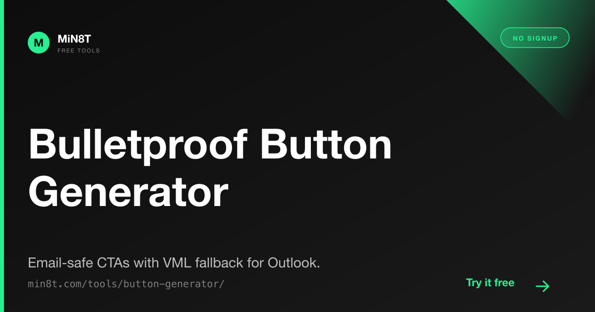
MiN8T Bulletproof Button Generator
Configure colors, padding, radius, font, alignment. Get the full bulletproof pattern with VML for Outlook desktop. Six presets (Stripe-style, Mailchimp-style, Pill, Square, Outlined, Minimal) for fast starts. Free, no signup.
Open the Button Generator →The full button workflow
- Decide the design. Background, text color, radius, padding. Score against WCAG AA contrast (4.5:1 minimum).
- Generate the HTML. Use the tool, copy the bulletproof block.
- Paste into a centered table cell in your email body. Outlook desktop needs the table-cell centering.
- Verify across clients with our Inbox Preview tool. The Outlook column should show the rounded button rendering correctly — if it shows a square, your VML is missing or malformed.
- Send a test to your real inbox in Outlook desktop if you have access. Real-client verification beats approximation for VML edge cases.
The single biggest win
If you've been shipping square buttons because "bulletproof seemed like overkill," switch to the bulletproof pattern on your primary CTA. Six lines of additional HTML, ~10% more of your audience seeing the button as designed, no downside. This is one of the rare email-marketing optimizations that costs nothing and works everywhere.
Skip Bulletproof Markup Entirely
MiN8T's editor includes bulletproof buttons as a built-in component. Drag, configure, ship. The VML wrapping happens automatically; the editor previews the button correctly in the Outlook approximation column. No hand-typing of <v:roundrect>.